Up
Identity, website and additional communications for child care organisation Up.
What we did
Brand strategy, Brand identity, Online strategy, Website, Communications

Challenge
Help over 20 separate locations connect with young parents and new talent.
Solution
Share everyday joy, in bright visuals and editorial content. Dare to be different.

Colorful identity
To communicate the core strengths of Up child care to young parents, we highlight them in the design. Modern typography, playfulness, a sense of adventure, flexibility. The colorful identity stands out from the competition and is very memorable.
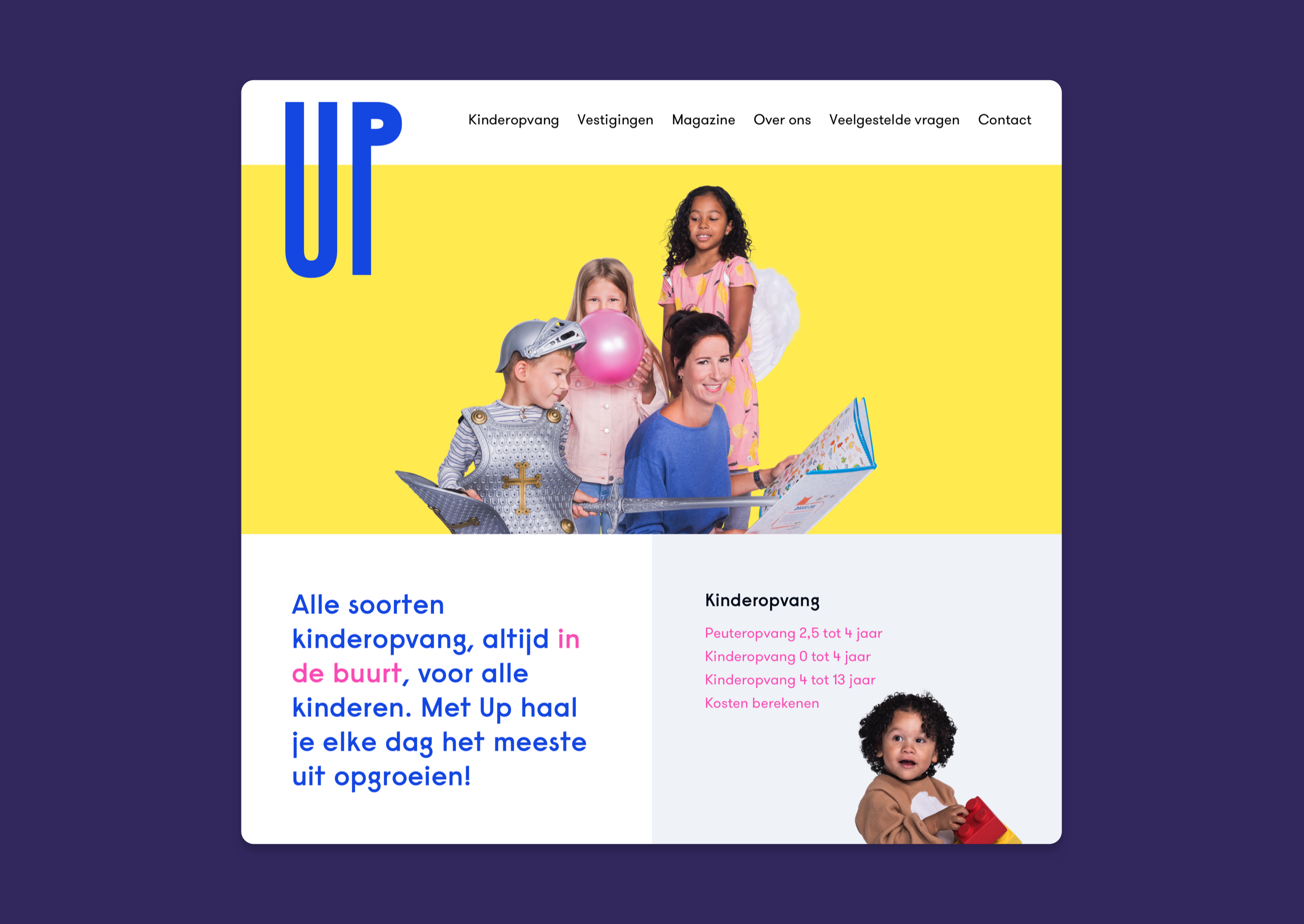
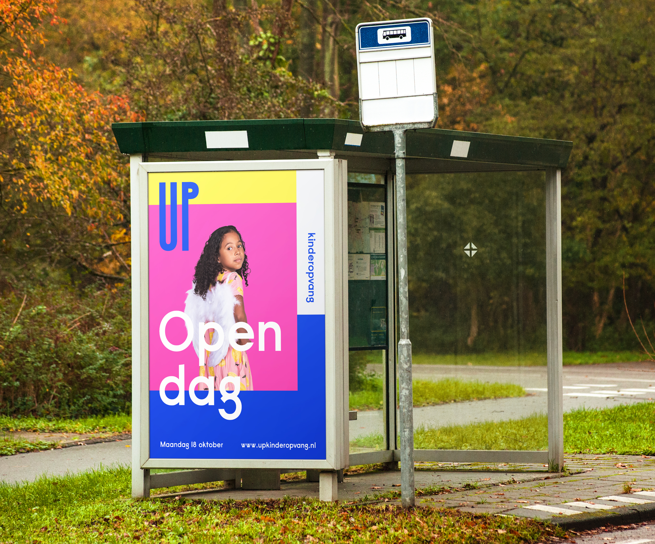
Flexible and consistent
Unique photography, variation in colors and a logo that adapts to its surroundings all fit with the organisation’s personal approach. A comprehensive style guide including advice on text and photography bring the necessary consistency.
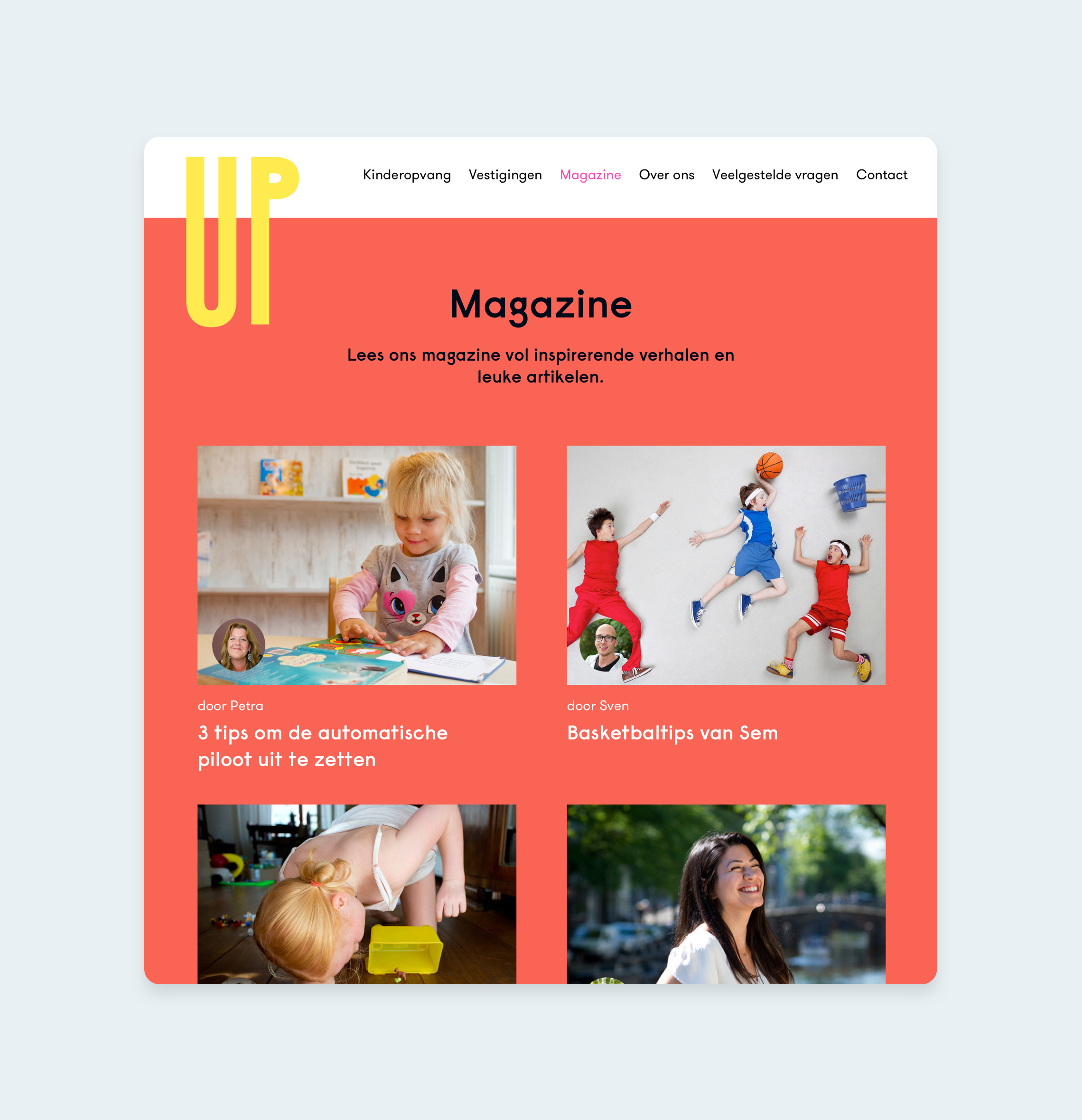
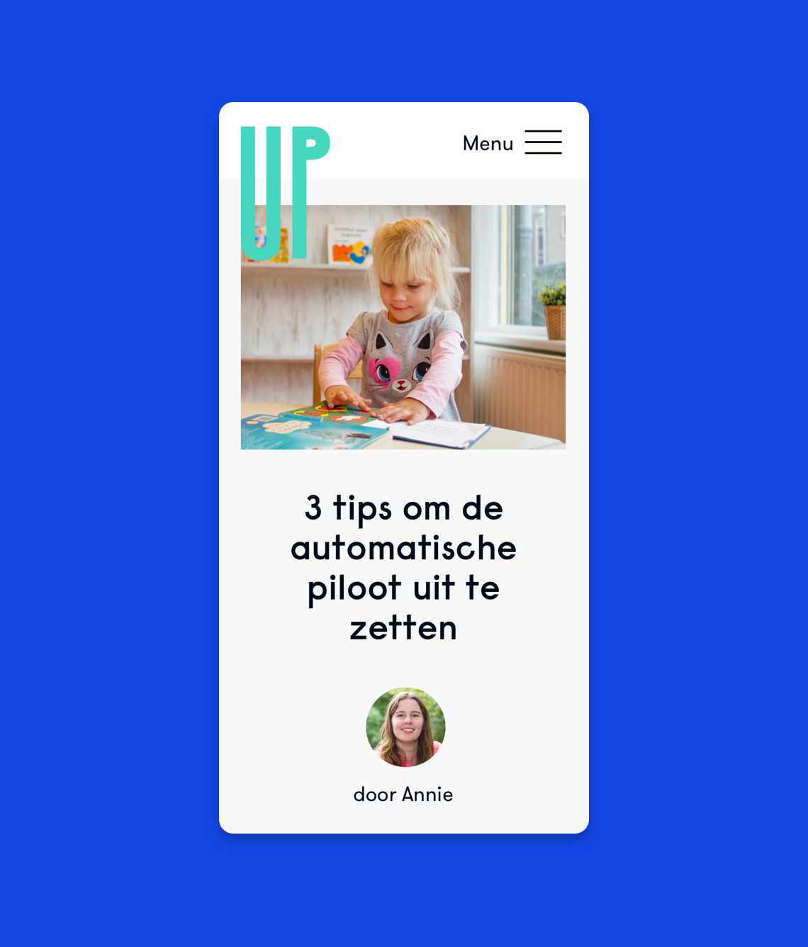
Modern website
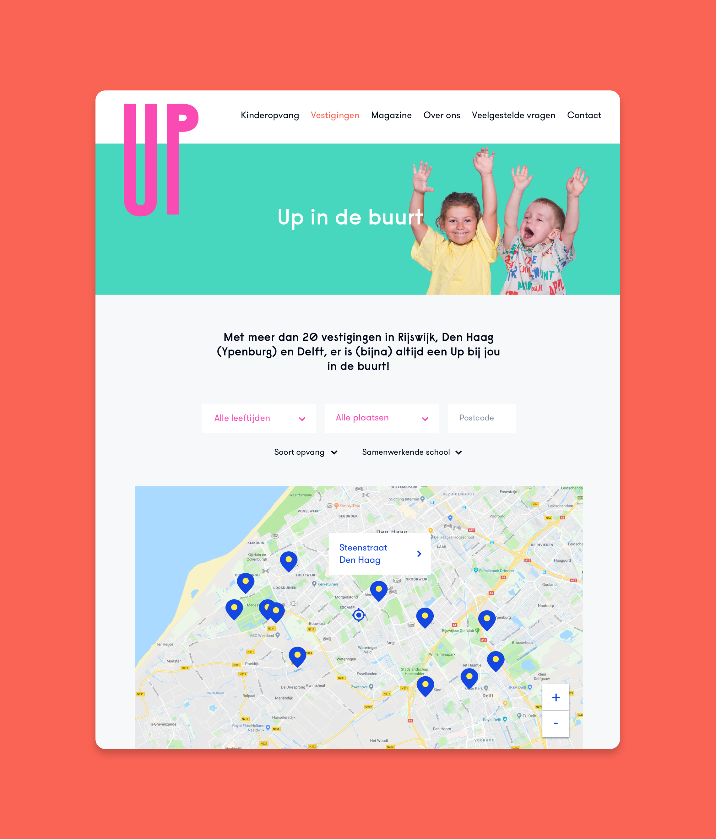
We designed and developed a modern, spacious site, available in multiple languages, with integrated smart forms and maps. The site is optimized for search engines, with regular updates and check-ups in order to keep a good Google ranking.
Check out the Up website here
Photography: Lennaert Ruinen
