Kolpa
Meaningful architecture – A visual identity and website for a unique architectural firm
What we did
Brand strategy, Brand identity, Website, Communication tools
Challenge
Kolpa has been designing and building meaningful buildings for over 60 years. They asked us for a new identity and website fitting their vision and approach.
Solution
More focus in their communication, with a colorful identity and a modern website that optimally showcases their work.
Related
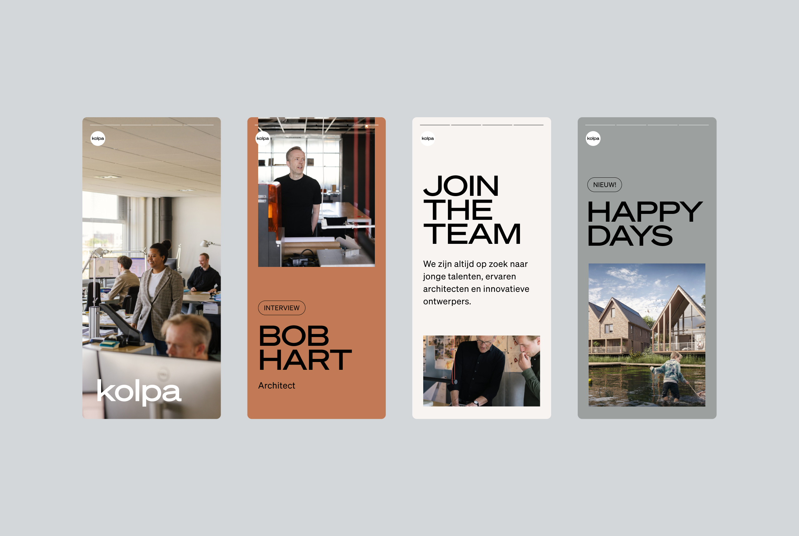
We feel directly related to Kolpa: a small team that listens well, is averse to trends and works first and foremost for the end user. The new identity emphasizes those qualities. Flexible, colorful and super accessible. We’ve chosen to highlight the pride they have in their work, their history and their fantastic team.
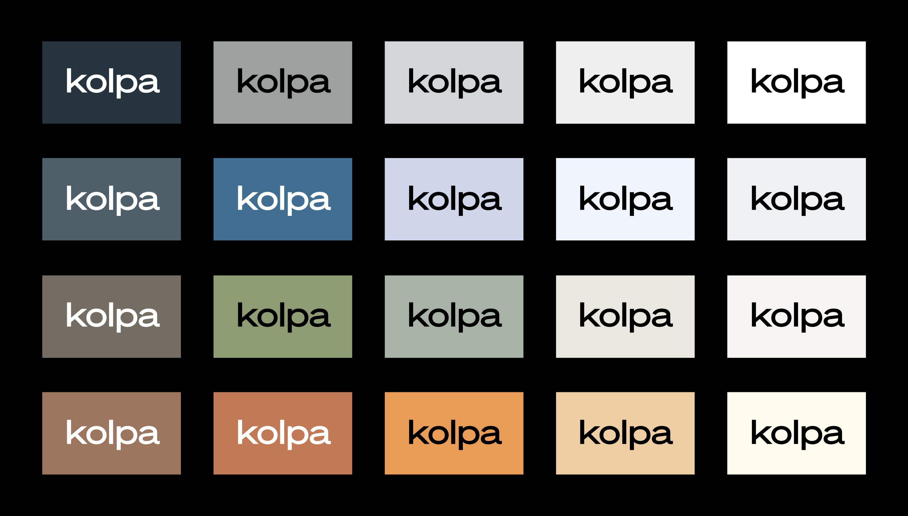
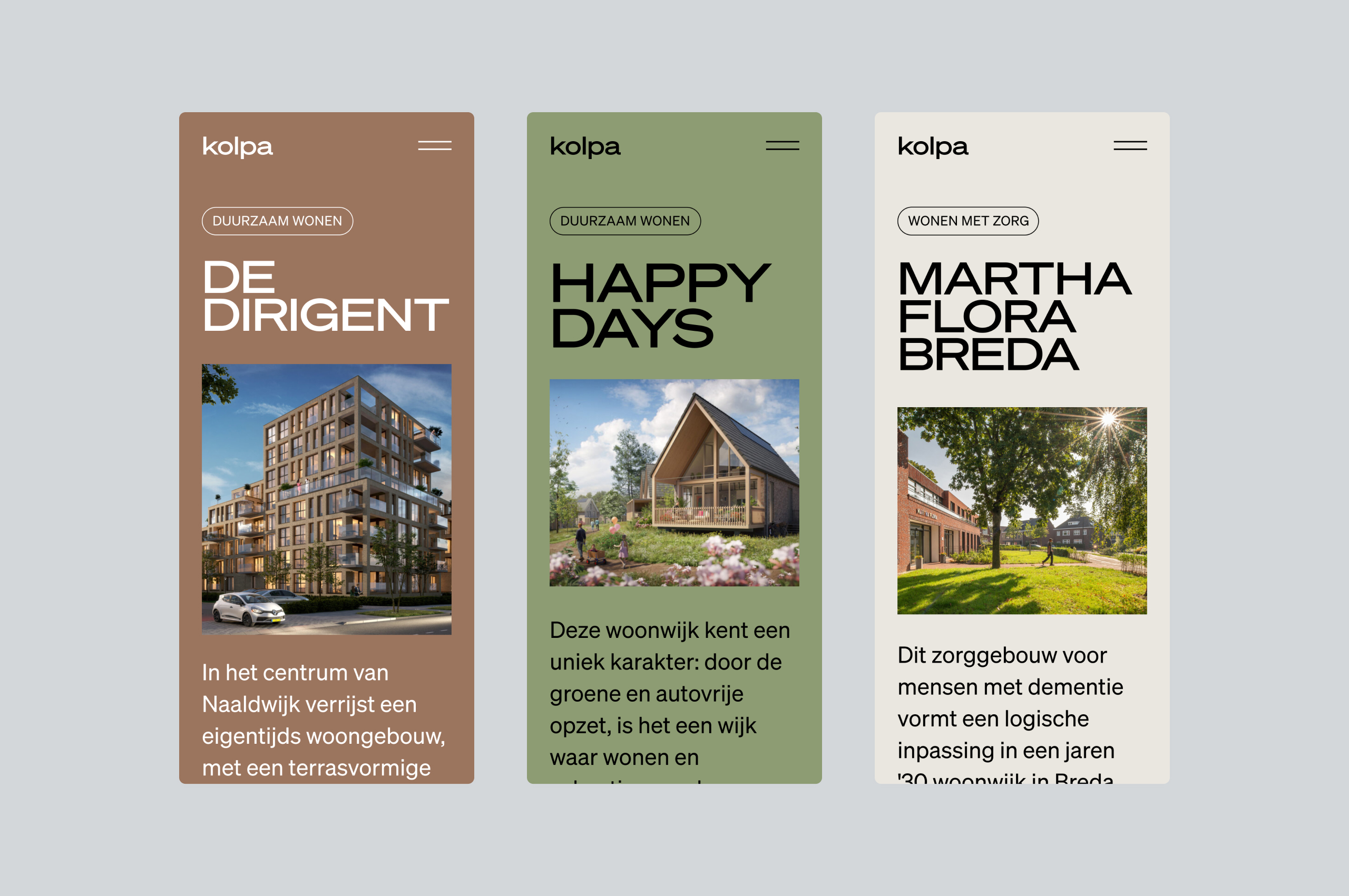
Colorful
We selected a broad color palette with many different colors. It enables us to give each case in Kolpa’s portfolio a truly unique atmosphere, matching the project. The result is truly dynamic, catching the eye and making Kolpa stand out from other architectural firms.
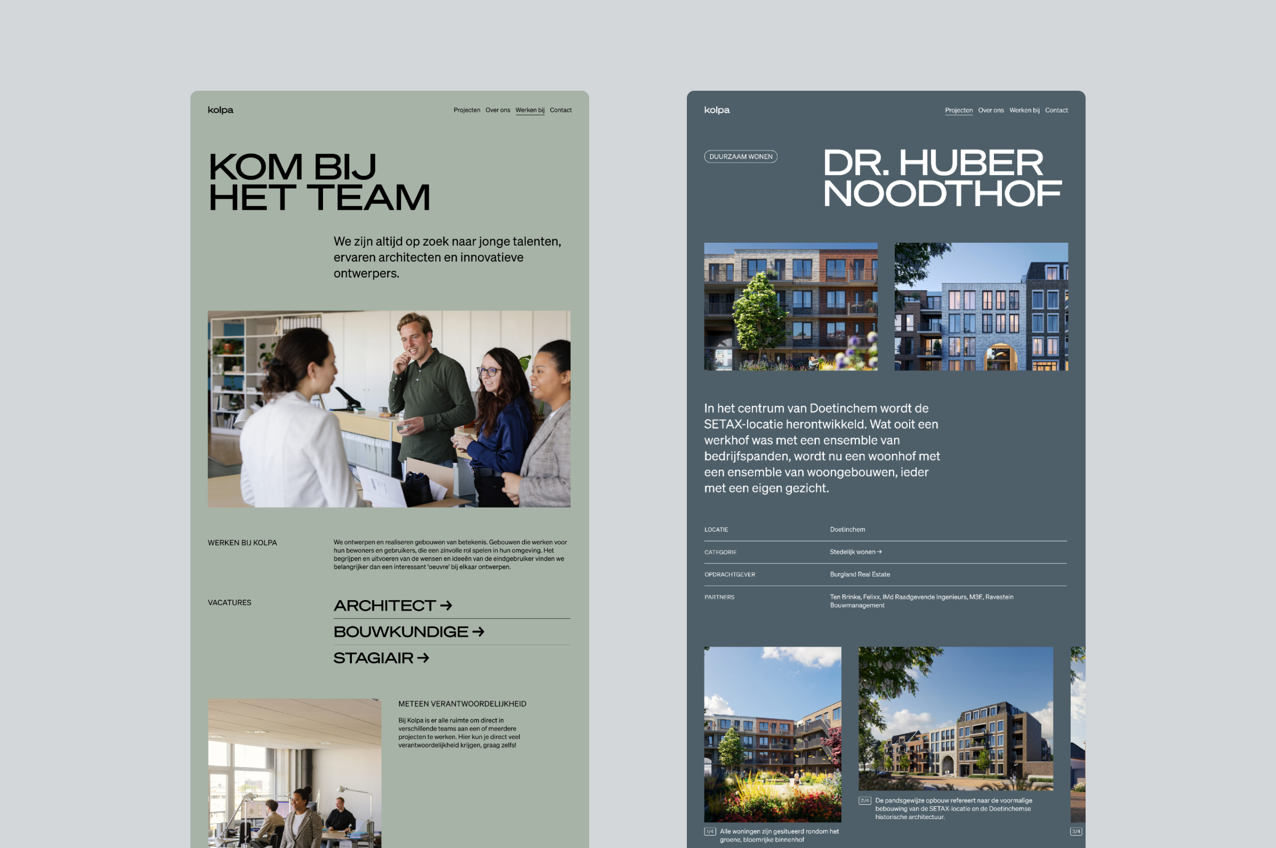
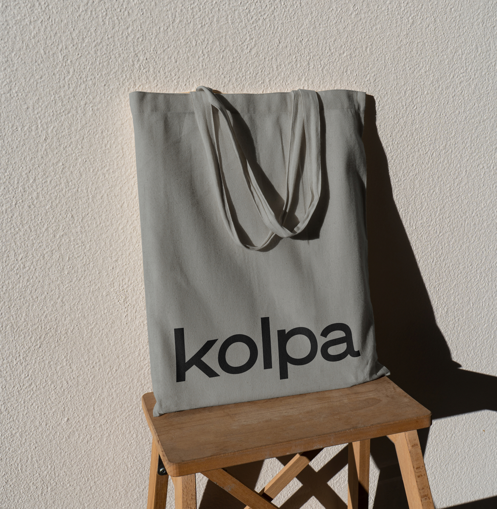
Logo
The logo received a small update, removing the word “architecten” where appropriate. It makes for a more down to earth, modern and immediately recognizable logo. We wrote short, modern copy with an informal tone of voice. Not pompous, but proud.