Studenten.com design
Platform for the best stories from student life
What we did
UX-design, Website

Challenge
A refresh for Studenten.com
Solution
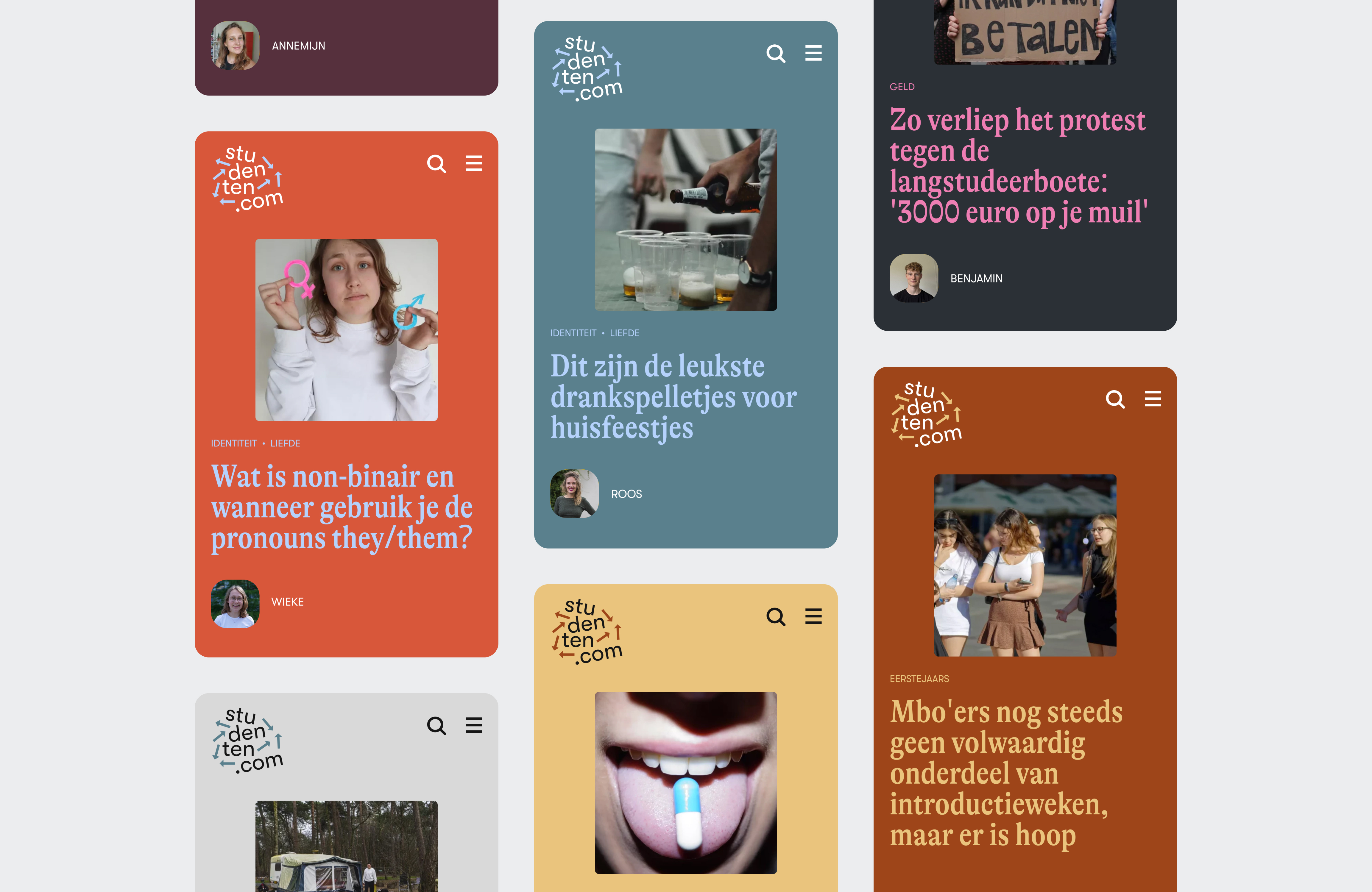
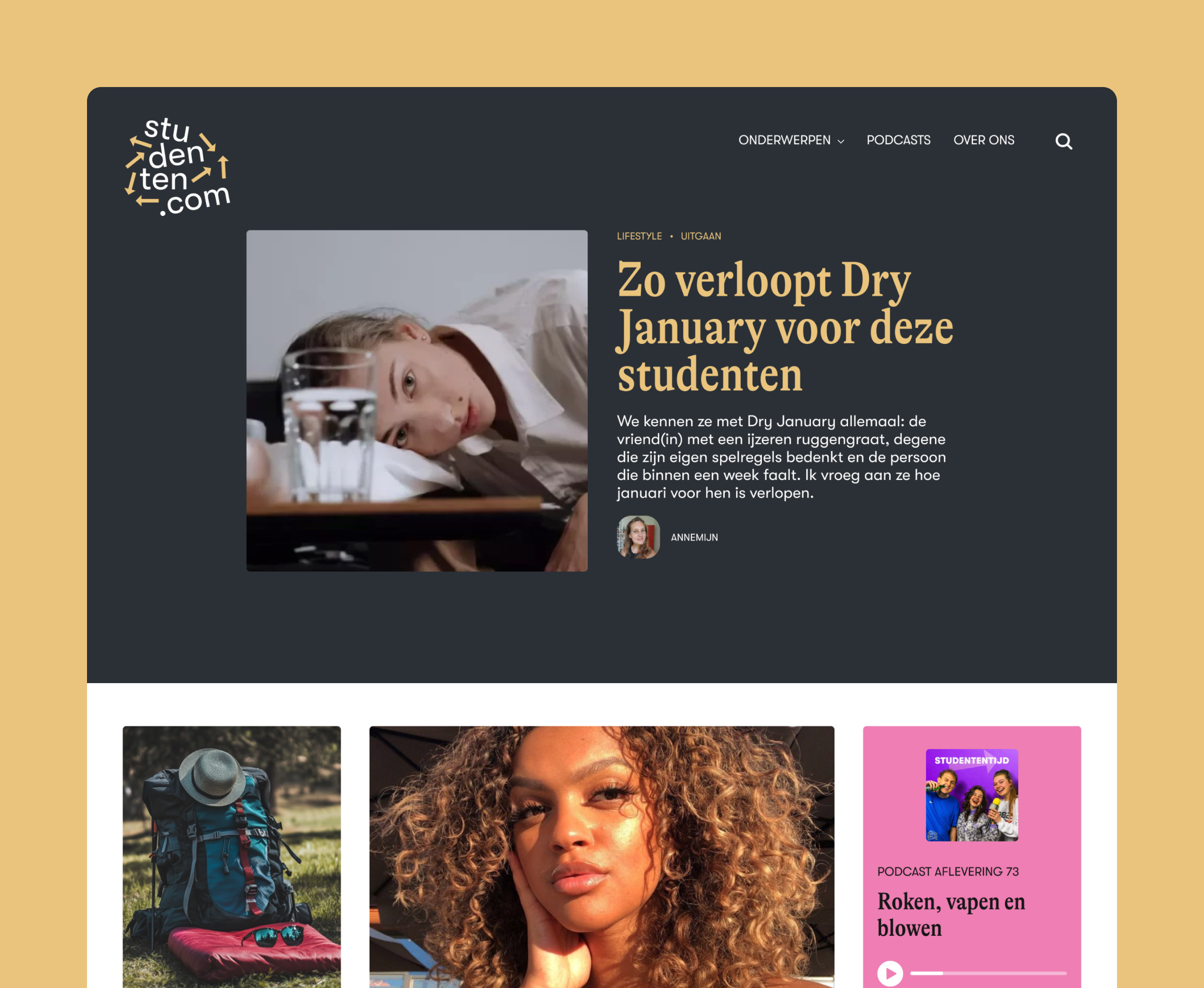
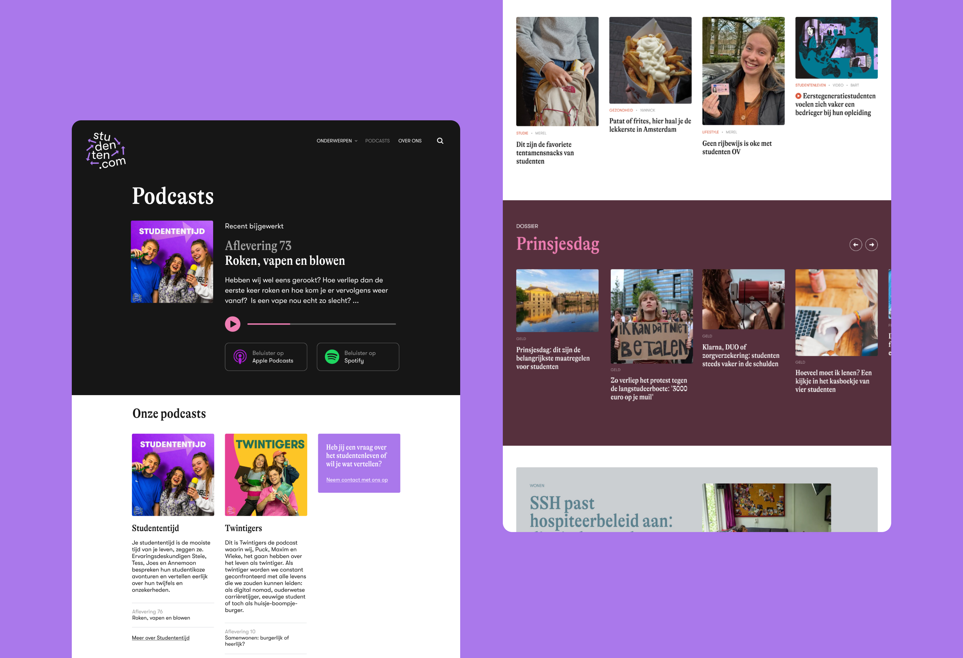
A bold, colorful redesign that focuses on good content.
Growing up
We have been working for Scholieren.com for a long time. They also run a website for students; Studenten.com, bringing real stories from student life. They deal with all sorts of topics, but their content is always personal, independent and true-to-life. Studenten.com has grown considerably, producing a popular podcast and employing a top editorial team. The old design didn’t present those qualities well: frankly, it was a bit old-school.

Own identity
Time for a more mature design then, for a platform that’s at the heart of student life. We’ve chosen for modern colours and a dynamic layout; anything might happen here. Stories and podcasts get more space and attention. The homepage features a big, almost full-page main article, in magazine format. The makers are also super important; their work and experience make Studenten.com unique, and not another news feed made by robots.

More than looks
Fresh color combinations, check. But the makeover is more than just looks. It’s also new energy for Studenten.com; more students read the stories and podcasts, the creators feel their work is better presented. We’re super proud of the result. And of course of what the makers of Studenten.com have been able to achieve, in between attending classes.
